Schiffman Supplies

A visual identity built around connections, movement and a modular structure.
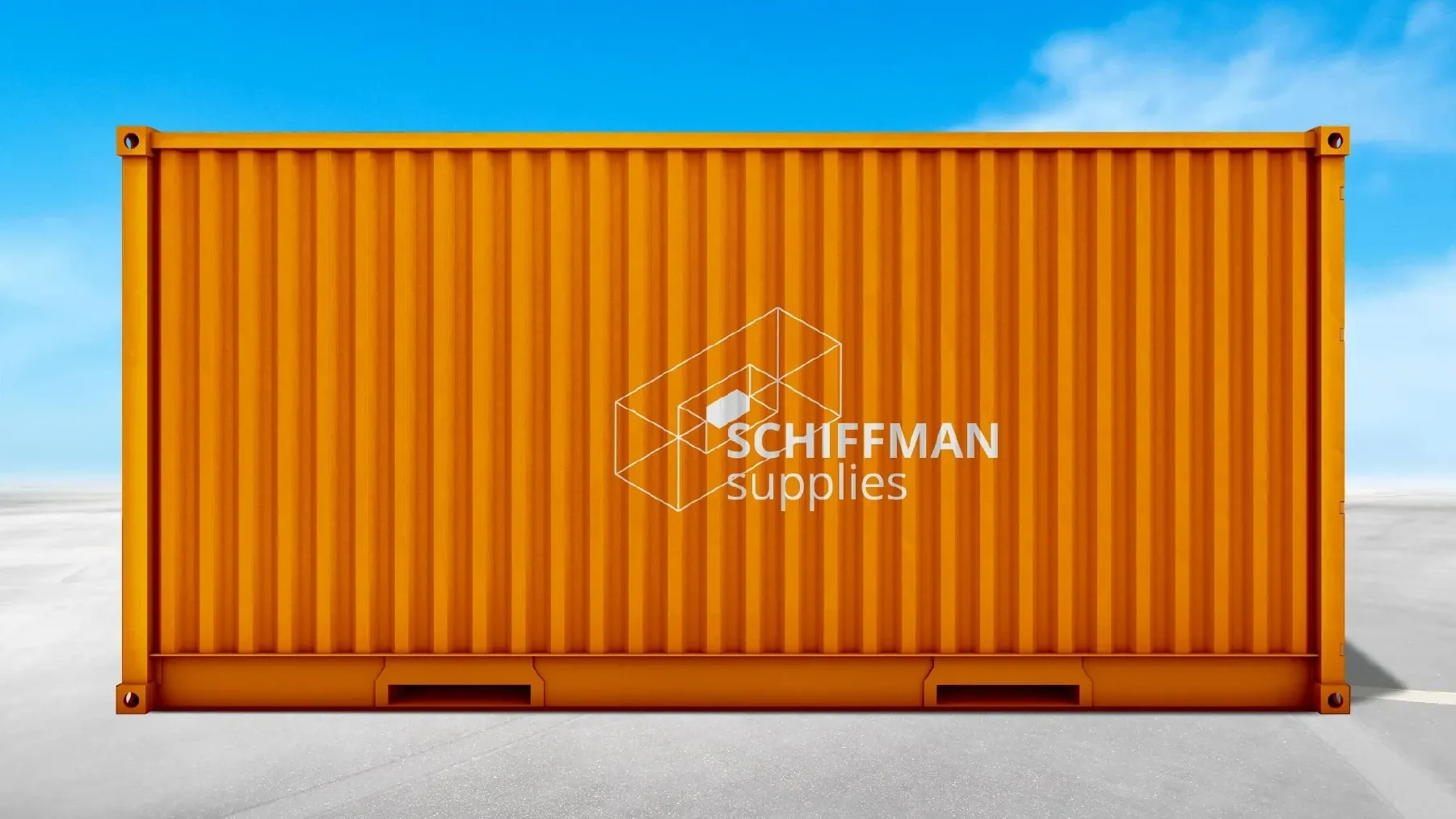
Orange shipping container with the Schiffman Supplies identity in white.
Visual identity ยท Application visualisations from the project presentation.

A system for moving things

Schiffman Supplies works with industrial manufacturers and suppliers in the B2B sector. The project brief brings together supply chains, import and export, distribution and consulting โ€” activities that connect different parts of a larger system.

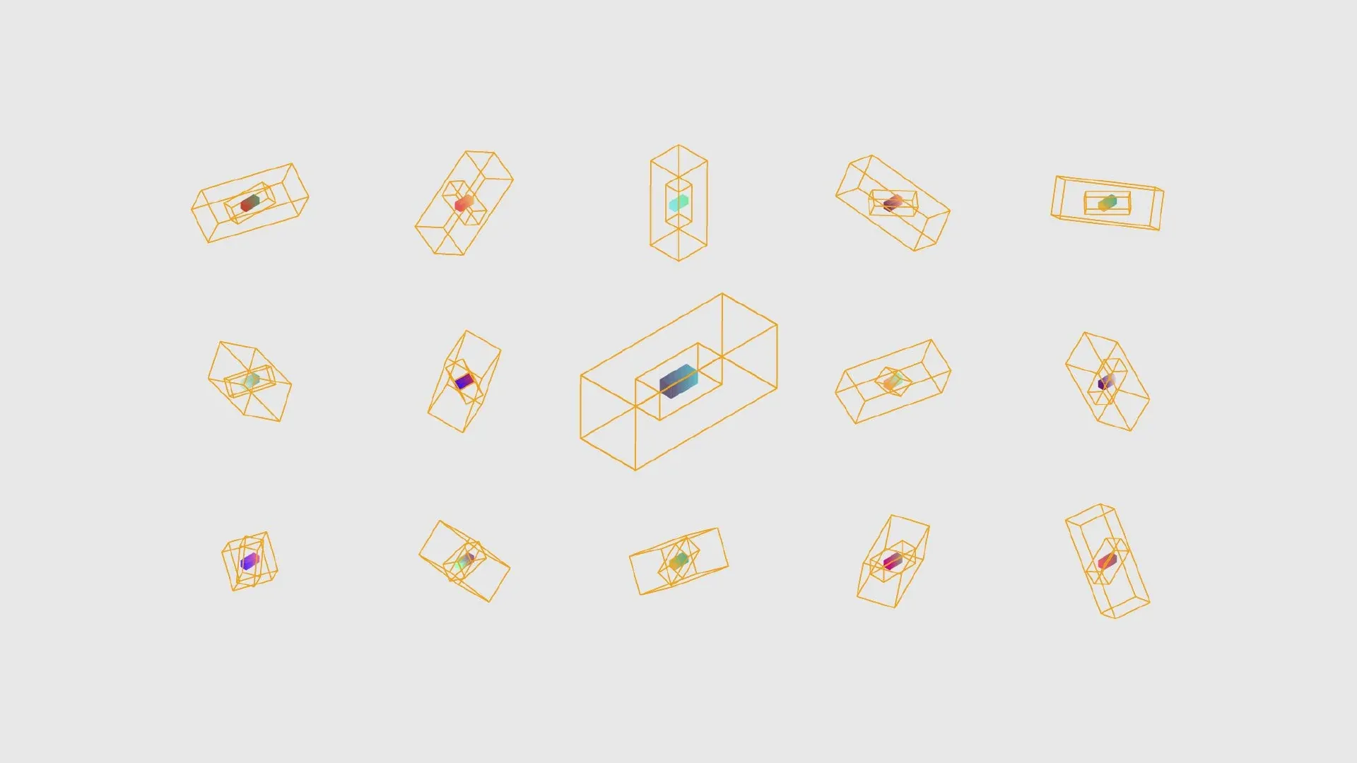
An open structure around a compact element.
Variations of the geometric frame around a central Schiffman symbol.
One construction, multiple orientations and combinations.
Schiffman Supplies logo: the coloured element changes within the open geometric frame.
The structure in motion.

Different connections.
One recognisable structure.

White geometric line pattern on a golden yellow field.Golden geometric line pattern on a pale grey field.

From mark to visual language

The frame can turn, repeat and become a pattern. Colour introduces variation without replacing the underlying geometry.
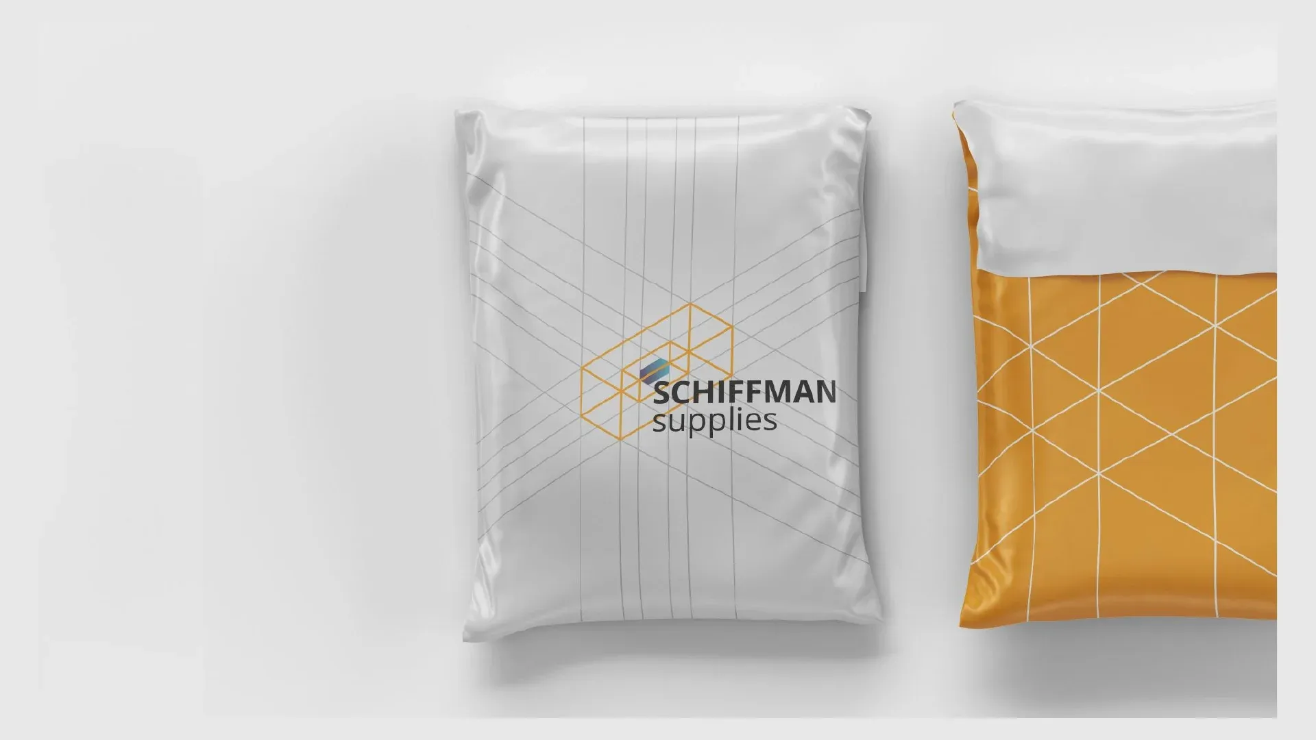

White and yellow shipping bags carrying the Schiffman mark and line pattern.
Packaging visualisation.
Delivery van with the Schiffman identity on its white side panel.
Vehicle livery visualisation.

Across scales

The proposed applications move from packaging to transport and signage. The same structure appears as a small signature, a repeated pattern or a large mark on an industrial surface.
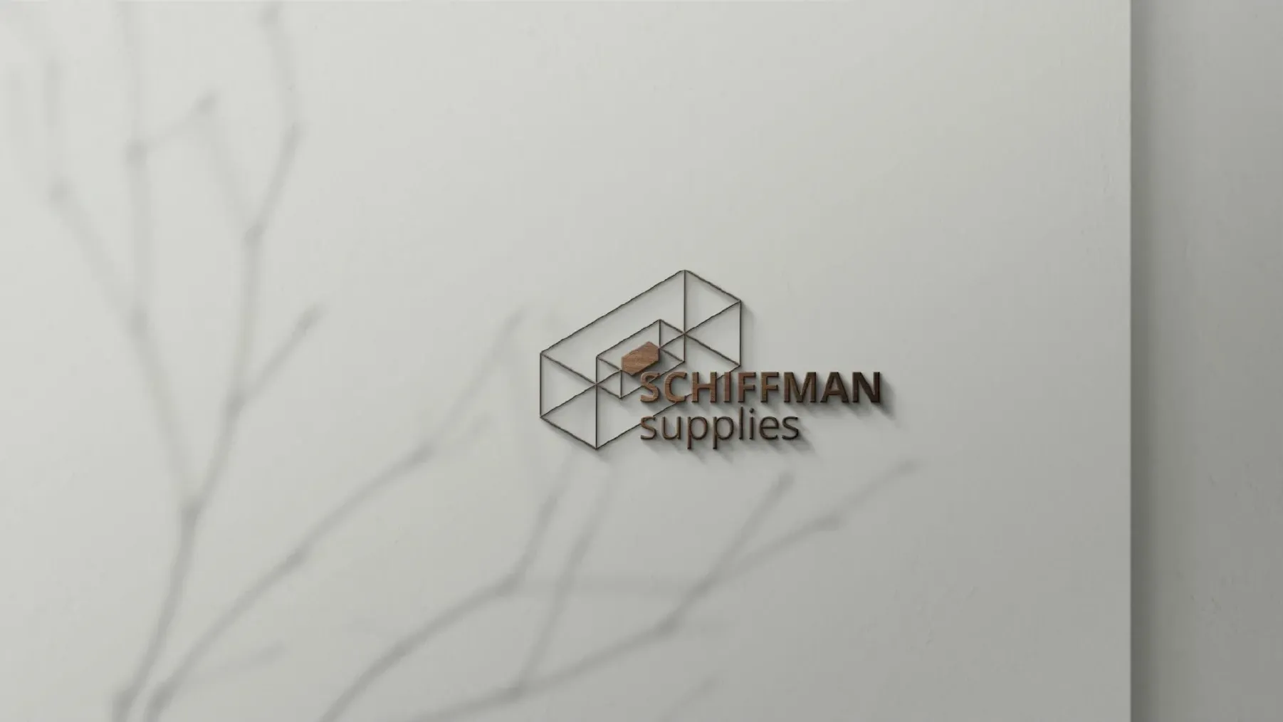
Three-dimensional metal Schiffman logo mounted on a light wall, casting a geometric shadow.
Signage visualisation.